How I Made a Step Feature That Turns Overload Into Manageable
Client
Lupl
Role
UX/UI Designer
Team
Product Manager, Design Lead, Fullstack & QA Engineers
Scope
Researching, UX Design, UI Design, Prototyping, Handoff, Gathering User Feedback
Platform
Web
Year
2024
What is Lupl
Lawyers are oftentimes flooded with documents, and instead of doing the legal work, they are in a constant battle, hoping not to miss a deadline. Lupl is a tool designed to streamline legal processes and workflows.
What challenged me
Ensuring that the feature is easy to see and use without overcramming the other elements; meeting the needs of stakeholders without compromising usability.
Impact
I enhanced the app’s overall usability by breaking down complex tasks into manageable steps, helping users reduce cognitive load. These changes also clarified task progress, enabling users to better understand where they are in the process and what comes next.

Context
How messy legal work can be
I chose to design the Step feature after we were being told the key requirements for MVP. The need for the feature came up several times in client-to-sales team discussions.
Until this moment, I knew how messy the legal work could be. If you are a lawyer from a midsized firm working on several cases, it’s almost guaranteed you will end up with dozens of tasks.
But if these tasks could be broken down into smaller ones, it would be easier for you to handle your huge amount of work.
Problem
A step is not a subtask
For MVP, this step feature was meant to be a checklist for tasks. The user could check and uncheck items under the parent task to see overall progress.
But they could not assign these items to team members or set due dates, like they do with tasks. Hence the name 'Steps'—to clearly differentiate from subtasks.
Even though the name was clear, we had to find a solution for visually communicating the exact same thing: a step is not a subtask, and even though it is displayed in the same table, you cannot use it like one.
I really wanted to figure it out, but I was not sure what to do.
Task in Lupl
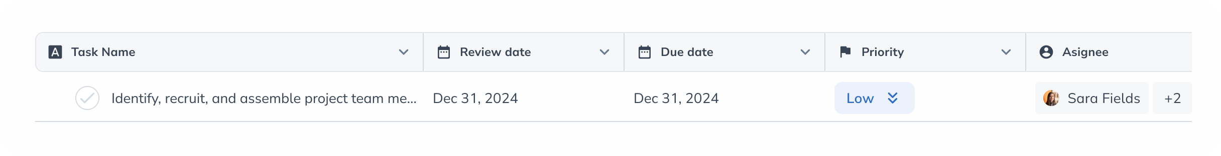
Researching
Let's see how others do it
So here I was, not quite knowing what to do but very eager to learn about the feature. Certainly, I wasn’t the first one to face this problem. So what better way to learn than to look at what other apps do?
The main thing I wanted to know was if other productivity apps let you assign subtasks or set due dates for them.
The main thing I wanted to know was if other productivity apps let you assign subtasks or set due dates for them.
Competitive Analysis

What I have learned
I found out that apps like ClickUp, Monday, or Asana will only show a subtask in a table if it supports adding columns to it.
However, only one, Employment Hero, displays subtasks that can’t be assigned. But they do not have any tables, just dashboards.
However, only one, Employment Hero, displays subtasks that can’t be assigned. But they do not have any tables, just dashboards.
On the path to a pleasing experience
First try: we're getting there
I presented the insight in a meeting with the product owner and stakeholders.
Thanks to the design lead's support, I felt confident enough to suggest that steps should be shown only in the siderail rather than in the table since users would not be able to use them as tasks.
Thanks to the design lead's support, I felt confident enough to suggest that steps should be shown only in the siderail rather than in the table since users would not be able to use them as tasks.
Steps only in siderail

Despite the fact that everyone agreed that having steps in the table could lead to usability issues, my approach was rejected. It was a must to make the feature visible, and hiding it in the siderail wasn’t an option.
Second try: still not The Solution
So, I experimented with adding the steps to the table. Usually lawyers task names are enormously long, and I thought, why not make the step full width? This solution turned out to be a gateway to another problem.
Because often users add many columns to a task, the icons ‘Convert to Task’ and ‘Delete’ became hidden. Users had to scroll horizontally to find out they could delete a subtask. This would lead the user to frustration, being stuck with an item they cannot delete. Not great at all.
Full-width steps

1
With full-width steps, users could hardly delete or convert a step without horizontal scrolling when having a multiple-column table.
Finding better solutions
A step forward
After trying different widths and discussing the solution with the team, I got the buy-in. It wasn’t perfect; it still needed a little tweak: a tooltip for long names.
Steps: final design


1
With step width reduced to task width, 'convert' and 'delete' buttons are visible.
2
Tooltip for steps with lengthy names.
Ready for handoff
Polishing and taking care of last details
After I gained clarity over the solution, I had to take care of all the component states for handoff. And be sure not to leave room for developer guesswork when it comes to flows.
Different states for steps

MVP is live
Everyone contributed
Thanks to all team contributions, we managed to launch the MVP for Steps in a timely manner. The feature was received well by users, apart from one question received by Sales: 'Why can't I assign steps to team members?' An issue that will be addressed during the future improvements.
